A guide helping clients understand the difference between print finishes.
Choosing between gloss, matte and satin finishes can feel harder than it should. There is no single best option because each finish changes how your print looks and how it performs. This guide helps clients understand the difference between print finishes so you can pick the right one for your project.

What each finish actually means
Before deciding which works best for different jobs such as business cards, posters or brochures, it helps to know what defines each finish.
Gloss
Gloss has a shiny, reflective surface that makes colours look bold and punchy. It is popular for image heavy work where vibrancy matters. The trade off is that glare can make text harder to read under bright light and fingerprints may show more easily.

Matte
Matte has a smooth, non reflective surface with a more muted look. Colours appear softer and text is usually clearer. It feels premium and is ideal for projects where readability and a refined tone matter. Matte tends to resist fingerprints better than gloss.
Satin
Satin is the middle ground. It offers gentle sheen without the high shine of gloss. Colours still pop but there is less glare, making it a versatile option for a wide range of print.
Which finish works best for common print jobs
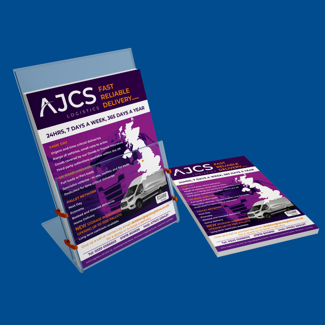
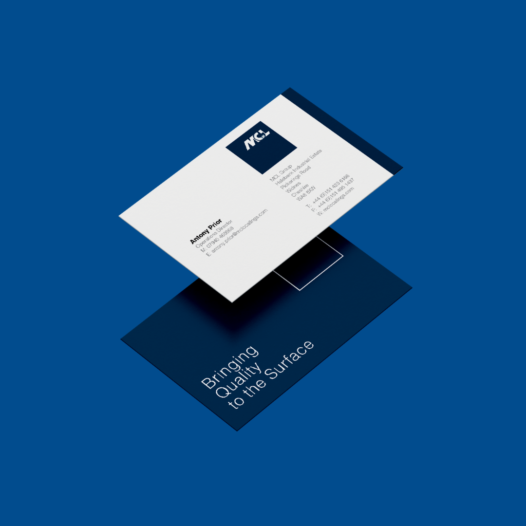
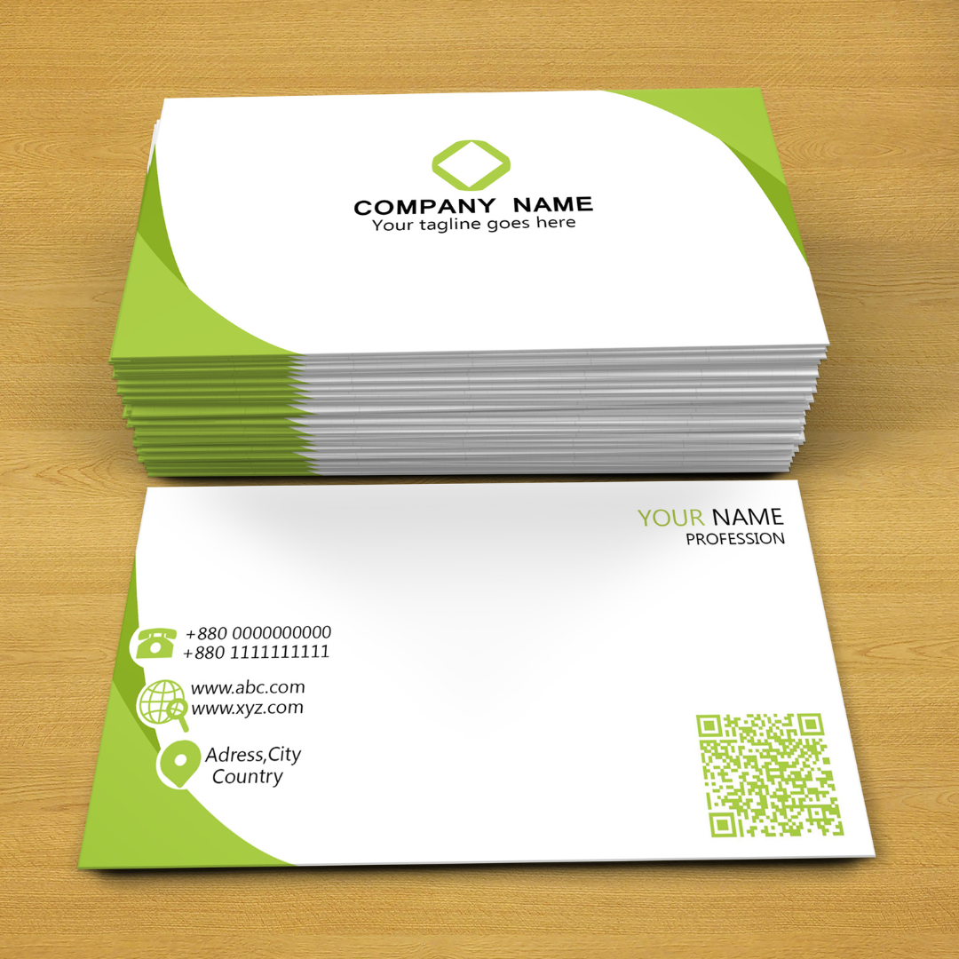
Business cards
Business cards need to balance design impact with durability. Matte is often chosen for its sophisticated feel and easy to read text. Satin also works well if you want a slight sheen without going full gloss.
Posters
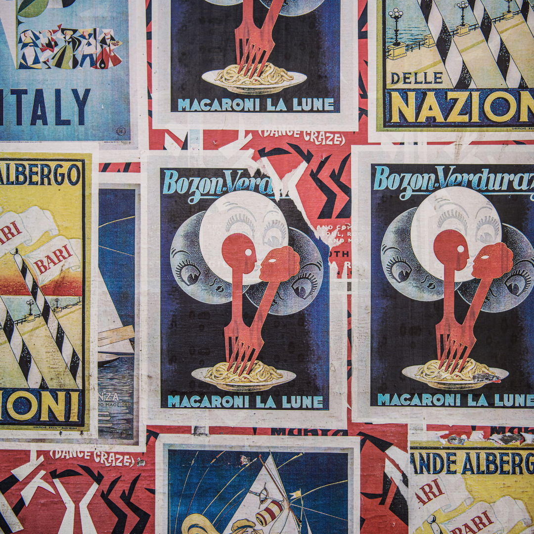
Posters rely on visual impact and strong colour. Gloss is usually the best fit because it enhances saturation and contrast. Satin is a good alternative for indoor displays where you want colour depth without heavy shine.
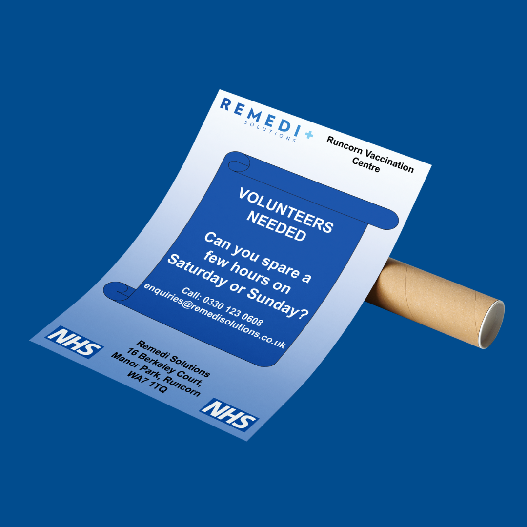
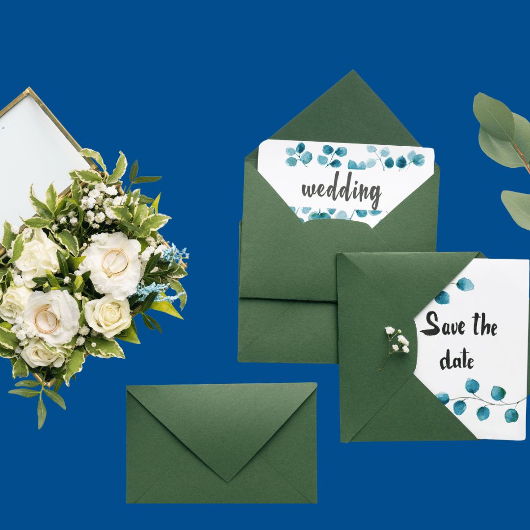
Brochures and leaflets
Brochures need both readability and visual appeal. Matte is excellent for text heavy layouts and longer documents. Gloss can be used for photo led designs while satin offers a safe middle option if you want a clean, professional look across mixed content.

Practical tips when choosing a print finish
Think about how the print will be used. If it will be handled often, matte or satin may be more practical. Consider lighting conditions because bright environments can make gloss difficult to read. Match the finish to your brand tone. A luxury brand may favour matte while a bold, modern brand may prefer gloss.
If you are ordering printed products, you can explore our full range of materials and options on our category pages.For general industry guidance, the FESPA website is a reliable external resource: https://www.fespa.com
A simple choice once you know what matters
Once you understand how each finish behaves, choosing becomes much easier. Gloss brings vibrancy, matte offers elegance and clarity and satin provides balance. Pick the finish that supports your design, your message and the way your print will be used.
If you’d like help tailoring finishes to a specific project, feel free to ask and I can adjust the advice.